
How I Built Flick in Three Hours
Web, iOS, Chrome, and three complete designs, built from A to Z with Fable 5 while it lasted. The code was never the bottleneck. The decisions were.

Hey.
Something unusual happened with Fable that week.
I started building with a model, and before I had time to write about it properly, the model was gone.
Anthropic released Fable 5 on 9 June (Three days they massacared my boy) later access was suspended. I got roughly three concentrated hours with it. At the beginning, I had a product idea.
By the end of the day, I had a working web application, a very, very good iPhone app submitted to the App Store, a Chrome extension, and three complete design directions for the same product.
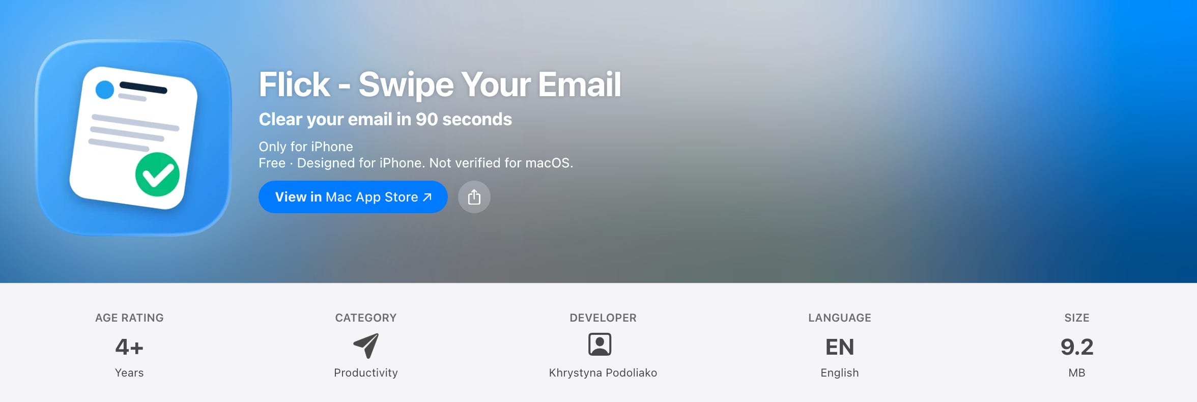
The product is called Flick.

The obvious version of this story is that an AI model wrote a lot of code very quickly. That is true, but it is also the least interesting part. The part I have kept thinking about is how little time I spent waiting for software to exist, and how much time I spent deciding what the software should be.
The code was never the bottleneck.
The decisions were.
A product with an ending
Flick turns your inbox into a finite deck of cards. One email becomes one card. One card becomes one decision.
You archive it, keep it, or ask for an AI draft that you review and approve yourself.
Then the next card appears.
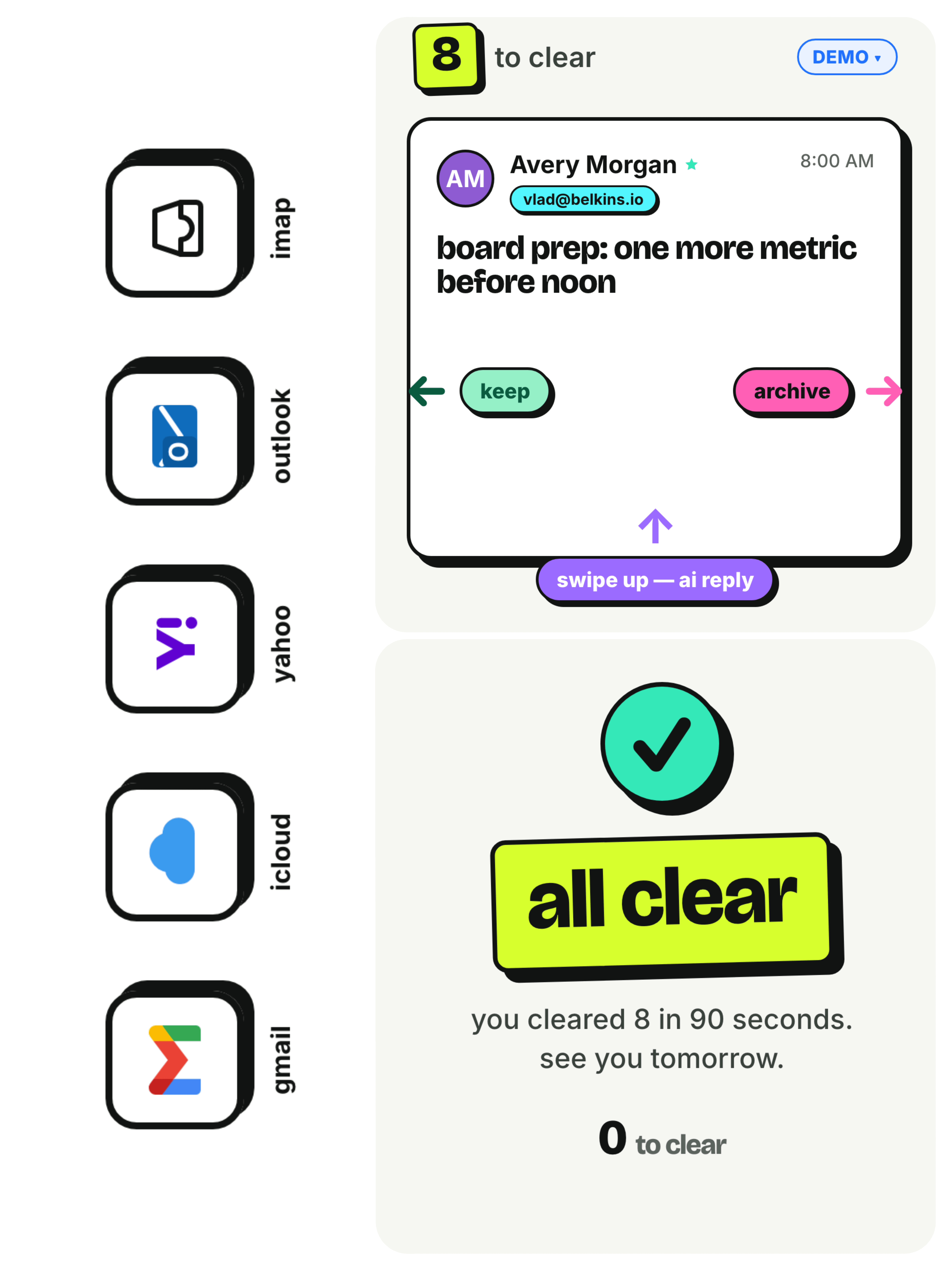
Eventually, there is no next card.
You reach the bottom of the deck. Flick tells you that the stack is clear, and then it has nothing else to offer. There is no infinite feed waiting behind the accomplishment, no streak that converts relief into obligation, and no red badge trying to recruit you back into the product five minutes later.
That ending is not an empty state. It is the product.
Most email software treats an inbox as a database that needs better navigation. More folders, smarter labels, stronger search, better summaries. All useful, but they preserve the assumption that the main problem is information.
I think the unit is wrong.
An inbox is not a pile of information. It is a pile of deferred decisions. Reply. Archive. Ignore. Approve. Decline. None of these decisions is particularly difficult by itself. The exhaustion comes from carrying dozens of them at once, each one quietly borrowing attention from your future self.
The swipe is not the invention. Swiping is borrowed grammar that everybody already understands. The real product decision was to change the unit from an email to a decision, then to make the number of decisions finite.
Once that became clear, the interface became almost inevitable.
One email. One card. One decision. The deck must end.
I thought the day would teach me something about how quickly AI can code. Instead, it taught me something more useful: when building becomes cheap, clarity becomes expensive.
The product took three hours to build.
The decisions took years to become obvious.
What three hours actually means
One day is the honest end-to-end number. Three hours is the honest active-build number.
I did not spend 24 hours typing while pretending sleep was a limiting belief. I spent roughly three concentrated hours directing the build, testing what appeared, rejecting what did not belong, and carrying one product rule across several surfaces. The rest of the day went into the less cinematic work that turns a build into something another person can use: accounts, permissions, deployment, privacy language, App Store material, Chrome packaging, screenshots, pricing, and submission.
There is another important qualification. Those three hours did not begin from zero.
They sat on top of years of building products, making bad calls, recognizing weak positioning, learning how App Store submissions fail, understanding where users hesitate, and developing enough taste to know when a polished screen is still wrong. LinguaLive had already forced me to learn parts of the iOS, subscription, privacy, and support machinery. Fable compressed the execution, but it did not manufacture the experience underneath my decisions.
This distinction matters because otherwise the three-hour number becomes theatre. Someone copies the tool and the prompt and expects the same result. Then the model produces something plausible, they cannot tell what is missing, and they conclude that the whole thing was hype.
AI compresses the time between a decision and its implementation. It does not make the decision for you, and it does not make accumulated judgment irrelevant. In fact, it makes judgment more visible because there is less technical friction available to hide behind.
During the build, Fable was strongest whenever the instruction contained a real product decision. “Make this prettier” produced options. “The deck must end, and the product must become quiet when it does” produced behavior. “Build an email app” was vague. “One email is one card, one swipe is one decision, and the user must be able to finish” gave the model a system.
That was the pattern all day. The model was extremely good at turning a clear constraint into working software. It was equally capable of turning an unclear instinct into beautifully implemented confusion.
Three surfaces, not three ports
I did not want three copies of the same application. I wanted the same product to fit three different moments.
The web application is the zero-friction surface. It lets someone understand the motion immediately, try a demo without signing up, and then connect a real mailbox when the value is obvious. The web is where the idea proves itself before it asks for trust.
The iPhone app is the thumb surface. Email is often processed in the small gaps between other things: on a train, in a taxi, in a queue, or during the five minutes before a meeting. A swipe deck makes sense there because it turns a vague intention to “deal with email later” into a contained ritual that can actually end.
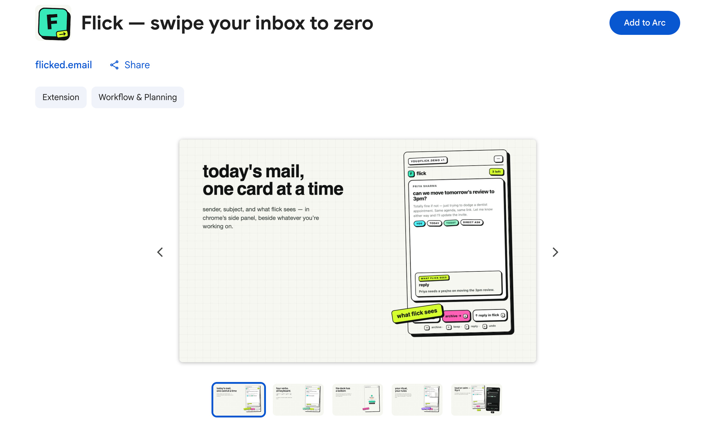
The Chrome extension is the proximity surface. It sits in the side panel beside whatever you are already doing. It does not inject itself into Gmail or watch your browsing. It is a small, fast doorway into the same finite deck, close enough to use without becoming another destination you have to remember. The extension is only 76.36 KiB, uses no Gmail content scripts, and stores no email on the device after the session ends.
These are not simply deployment targets. They are three pieces of distribution built into the product itself.
The web removes commitment. The phone creates a habit. Chrome removes distance.
That was another lesson from the day: distribution is no longer something you attach after the product is complete. The surface changes how the product is understood, when it is used, and whether it has a chance to become part of someone’s behaviour.
Three designs of the same truth
The most revealing part of the day was not the swipe engine. It was a disagreement I had with myself about what kind of product Flick was.
The product underneath was clear. Flick should feel finite, calm, and slightly rebellious towards the productivity industry. But there were several honest ways to introduce that product, and each one implied a different relationship with the reader.
In the old workflow, this is the point where a team chooses one direction based on a moodboard, a presentation, and whatever can be afforded before launch. The other possibilities remain imaginary. You are forced to commit before you can really compare.

Fable changed the economics of that decision. Instead of debating three directions in the abstract, I built all three.
